[RESULTS] VALENTINE'S DAY AESTHETIC COMPETITION

  • EVERYONE FAR AND WIDE, THE MOMENT WE'VE ALL BEEN WAITING FOR...HAS FINALLY COME!!

    The results of Rainbow's 2021 Valentine's Day Aesthetic Competition!!

    :jihyo3:


    But first, before we get to the results, let's give a huge round of applause to the judges! They worked hard to give out their ratings and reasonings despite them having other responsibilities to attend to.


    Give it up for, Pikachu-Senpai  bunnyviolet  crystalblues and Kairina

    They made this possible, couldn't have done it without them <3


    And then we can't forget the long list of names that helped to participate in the voting polls! Thank you guys for partaking in that! I was really pleased on how much nonparticipants/judges participated in this voting!!


    Thank you Pikachu-Senpai for helping out with prize costs and thank you Ves for offering to award the first place winners custom static badges :borahae::borahae::borahae:


    Thanks for EVERY contestant that participated, I really appreciate it and honestly thought that it was going to flop. Even if you dropped out or didn't make it to this final round, I thank you too for considering!


    Thank you to the ones that did get a submitted aesthetic in, I know you guys worked super hard and I can't thank you enough for working so hard on these <3


    :dahyun3:

    ---

    AND NOW...DRUM ROLL PLEEEASSEEE!!!


    here are the winners of the aesthetic competition!!


    In third place, we have Yoonminnie who made a masterpiece that Cupid Jimin who shot the judges heart with their aesthetic, making them fall in love! They will be receiving 700 akorns <3


    In second place, we have Dubucub who with the power of Dubu and accessories to complete the aesthetic look, they were able to shake the hearts of the judges! They will be receiving 1,000 akorns


    In first place, we have not one, not two but THREE winners @dummi  the101 and CITY who all three not only blew the judges away but the voters too!!


    Round of applause for the winners!!

    :jihyo1::jihyo1::jihyo1:


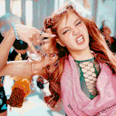
    Now, contestants, take the time to see the scores and reasonings you received from each judge! Keep in mind that every reasoning was copied word for word, no alterations made! :p :P 

  • @dummi scores

    1. Voting scores: 2nd Place (5 points to final score!)


    Judge Scoring


    Pikachu-Senpai

    10/10


    Reasoning: WOW STUNNING. This is so aesthetically pleasing to look at. The colors, the images, the gif, wow everything is just breathtaking. Simply gorgeous!


    bunnyviolet

    10/10


    Reasoning: Now this is a really stellar piece of work. I'm already very weak for the Strawberry Moon MV as it honestly has some of the most pretty and dreamy visuals from a music video that I have seen. The sig images are almost grandiose and so vibrant and of course the dp is adorable. It's dreamy and romantic, and I really adore it. Well done!


    crystalblues

    8/10


    Reasoning: My IU bias aside, you did a good job composure wise. I loved that you stuck to a theme and kept it throughout all of the images in your signature, I wish it was not so huge (took a minute to load the whole thing) the PFP is beautiful. Just a tiny bit better execution and it would have been the highest score so far for composure alone.


    Kairina

    10/10


    Reasoning: omg this looks so pretty!! :itzy19: good job dummi!! :itzy36:


    FINAL SCORE: 40/40


  • ghostings scores


    1. Voting bonus points: --

    Judge Scoring


    Pikachu-Senpai

    7/10


    Reasoning: I love! It's so cute and what better form of love is there than self love? I love the gifs she chose and how they all come together to match. My only thing is her bias list looks out of place. Maybe if it was red or had hearts instead of stars it would feel more cohesive?


    bunnyviolet

    7/10


    Reasoning: it's not bad. I like the greenish colors in the gifs and you can feel a bit of the chemistry between the two people well. Personally though, the dp gif isn't doing much for me. It's cute but idk I feel like there is something cuter and more charming that could be used. And maybe an extra visual element could be added to the sig to make it pop more? But that's a small thing. I do like it overall!


    crystalblues

    8.5/10


    Reasoning: the sizing and overall thing is fantastic <3


    Kairina

    8.5/10


    Reasoning: cute :omg6:


    FINAL SCORE: 31/40

  • ducky-mioda scores


    1. Voting bonus points: --

    Judge Scoring


    Pikachu-Senpai

    9/10


    Reasoning: I LOVE the use of the Valentine's candy hearts. I'm into Vaporwave aesthetics so I understand the feel of it. It's very cute and I like it. I just wish you didn't use the red roses and used purple or pink instead because the red roses stand out too much and stick out. Overall quirky and cute!


    bunnyviolet

    7/10


    Reasoning: You certainly took this in a more interesting direction. The bright colors and collage style feels very modern and fresh.


    There are certain things in here that could be adjusted to make this stronger. While I do like the asymmetry in the sig as it's very visually interesting, I would also like to see it more unified. By that I mean... I think some of the elements in it should be more spread out rather than concentrated in specific areas.


    Like for example, you have candy hearts in one corner and roses in other. It could be nice if roses were in 2-3 places and the candy hearts were in 2 places. Being more spread out like that rather than concentrated would serve to make the sig feel more cohesive.


    However, the color scheme is wonderfully consistent. Mainly pink with splashes of other colors like yellow, green, red, and purple thrown around it. I like it. It's fun and these splashes are in different areas of the layout which makes it look more purposeful and cohesive.


    Another thing I have to note is that I found what you did with the eyes interesting. The pink coloration and the heart covered eyes in the dp... it kind of gives it something slightly/creepy... not to the point where it's like straight up horror, but it is slightly unnerving nonetheless... and I actually really like it! It's sort of playful.


    Also, for the dp, I would prefer it if the text for love was a bit lowered... just how close it is to the face is kind of uncomfortable and makes it too center heavy... give the center a little breathing room.


    Overall, this is a really cool concept that could be worked on a little to be made much stronger! Nice job!


    crystalblues

    7/10


    Reasoning: love the PFP but the sig is a clusterfudge and is so random, it looks like you pasted a bunch of stuff on it and did not work on composure or an concept at all. I know you have done better so I have to give you a lower score.


    Kairina

    7.5/10


    Reasoning: love ur sig but tzuyu looks scary on ur pfp :woow:


    FINAL SCORE: 30.5/40

  • Dubucub scores


    1. Voting bonus points: --

    Judge Scoring


    Pikachu-Senpai

    10/10


    Reasoning: Reminds me of Powerpuff girls valentine's day specials! So cute and I love the added internet touch to it for all those who are celebrating it on the internet! Love it, it's so adorable!


    bunnyviolet

    9/10


    Reasoning: This is so cute! The pink hearts and gifs are just amazing! I really love how cohesive the colors are throughout the look and the use of all the hearts everywhere gives the aesthetic a strong, unified look!


    I guess my nitpick for this would be the website/file window thing on top of the sig and the scrolling bar below it. It's cute and gives it... I guess a more modern look, but I also don't know if it's that necessary to the look or adds much to it? It might be nice if the top part had some hearts on the image and maybe some hearts next the scrolling bar? I don't know, something more to give more justification to it's addition.


    Overall, very well done and thought out! Good job!


    crystalblues

    10/10


    Reasoning: very well put together very cute very clean


    Kairina

    9/10


    Reasoning: dubu :lover2: love it it's so adorable :cutes: and the color matches well but the length of the upper gif/first gif of the sig isn't proportional with the 2nd gif sorry :pleading:


    FINAL SCORE: 38/40

  • xx-jenn-xx scores


    1. Voting bonus points: --

    Judge Scoring


    Pikachu-Senpai

    9/10


    Reasoning: I love this! It's so cute and I love that she used a grid for the signature! It's definitely Valentine's themed with all the hearts used. My only wish is that the avatar was more pink so it could have matched the color layout of the signature more?


    bunnyviolet

    9/10


    Reasoning: This is really well done! The pastel, pink hearts in each image for the sig really unifies it. And the glitter/sparkles really make it pop! The dp is simple and super adorable too, which works well with the theming.


    My only critique would be is that the color scheme between both the sig and dp could stand to be a tad bit more unified. Either the dp needs more blue in it to match some of the blue colors of the sig or the sig could use more of a similar darker pink color that is featured in the background in the dp. That would make the look more cohesive. But I will acknowledge that this critique is on the nitpickier side, so I don't think it's that big of a deal. They are both mainly pink which means they don't clash, which is the most important aspect. This is a just a small tweak that could potentially elevate the look, but it works really well as it is. Well done!


    crystalblues

    7/10


    Reasoning: it is very cute the pfp especially, I will say I was very let down I have seen you do cuter and more creative signatures even with pink themes. I know you have your own personal stuff going on though. <3 I love how you formulated the text though for sure around the signature photos.


    Kairina

    8/10


    Reasoning: ur pfp is cute and ur sig is pretty but it looks blurry sorry :pleading:


    FINAL SCORE: 33/40

  • Yoonminnie scores


    1. Voting bonus points: --

    Judge Scoring


    Pikachu-Senpai

    10/10


    Reasoning: Super cute edit! I love it and it's very Valentine's themed! The colors are fantastic and I love how the PFP and signature matches. It almost feels like Jimin is Cupid himself in this edit!


    bunnyviolet

    10/10


    Reasoning: This is just literally super perfect. The pink color scheme is so pleasing to look at! I love how everything is laid out and works together. All the elements work harmoniously and don't clash. Jimin in the center draws you in immediately, and I love it! I like how the heart behind him gives him a slight halo which further catches your eyes. The various shape languages from the curves, straight lines, the different font and shape sizes are so great. There is a slight symmetry to it but it isn't perfectly symmetrical which makes it satisfying but very interesting to look at. Overall, very nice and thought out!


    crystalblues

    9/10


    Reasoning: This looks like one of those old tumblr themes but in a good way, great composure everything is layered cleanly and you can tell you spent a few hours in photoshop trying to decide what to do. I am again kinda sad I am not too familiar with you as a user because your art is fantastic


    Kairina

    8.5/10


    Reasoning: the color is pretty and ur love for jimin is cute :borahae:


    FINAL SCORE: 37.5/40

  • kittykitka scores


    1. Voting bonus points: --

    Judge Scoring


    Pikachu-Senpai

    8.5/10


    Reasoning: I love the Dark Valentine's idea and aesthetics! It's super creative and is outside of the box thinking. The avatar is kind of dark so I wish it was a bit more clear! Also I'm not a fan of the font, I'M SO SORRY DFLFKJGLH


    bunnyviolet

    10/10


    Reasoning: I really adore this! The regal, dark elegance is super gorgeous, and the imagery of the two swans is really stunning. And man I'm a sucker for sunset color schemes. Well done!


    I do agree with Pika that the font isn't the best choice. A serif or maybe a cursive style font would match the elegance a bit better. Perhaps even some gradient colors would elevate the text look a bit more too.


    crystalblues

    5/10


    Reasoning: I love ya I do but I feel like for this you just chose a couple gifs and smacked them up on the site's insert images option. There is no pattern or custom use of them, there is no editing or anything, as much as I love Lisa and Jennie just using photos of them for an competition of aesthetics without doing anything to them is kinda a little bit of a let down. <3


    Kairina

    8/10


    Reasoning: i love ur sig it's so pretty but it doesn't really match with the pfp sorry :pleading:


    FINAL SCORE: 31.5/40

  • SooYoung scores


    1. Voting bonus points: --

    Judge Scoring


    Pikachu-Senpai

    8/10


    Reasoning: Really well done aesthetic but I don't get a lot of Valentine's from it overall! Maybe if the colors were more pink and red or if hearts were added? But still very well done and super cute! Matching PFP and signature as well <3


    bunnyviolet

    8/10


    Reasoning: This is pretty nice! As a teen, I read/watched bl so this gives me some nostalgia. The warm colors and soft vibes of the gifs is so lovely and makes me feel fuzzy!


    I think you could give the sig an extra visual element to make it pop. Perhaps some kind of border around the gifs? Or perhaps you could make the text a tad more fanciful with some kind of visual element? Just something extra to really push it!


    Overall, it's gorgeous and I love it!


    crystalblues

    8/10


    Reasoning: very cute very simplistic I like it


    Kairina

    7/10


    Reasoning: this fits the valentine theme but the gifs have poor quality sorry :pleading:

    FINAL SCORE: 31/40

  • LovenRose scores


    1. Voting bonus points: --

    Judge Scoring


    Pikachu-Senpai

    8.5/10


    Reasoning: I love this Princess theme! Very creative and the signature is GORGEOUS. I also love the font they used as well. Good choice in theme. It took me a while to realize the PFP was Cinderella and I wish the red roses were blue instead to match the overall theme more.


    bunnyviolet

    7/10


    Reasoning: I do really like this! It's very elegant and fairytale. The dp is super gorgeous and I like that it has blue and a rose motif like the sig. The shapes of the text in the sig totally mirror some of the patterns in the sig pictures as well as the curves of the magic dust in the dp. Everything is totally tied together. I guess my one critique would be that there might be too much going on? Some elements could be toned down. Perhaps remove the butterfly since it's not really adding much to the look and simplify the sig by removing some flowers and perhaps only give the first word of the text that fancy caps letter and not the rest. But other than that, it is really lovely!


    crystalblues

    7/10


    Reasoning: I would have made the image for the signature and the text a bit smaller, not a lot but a little more reasonably sized. I love the fairy tale theme though it was a nice touch! the pfp was very well done!


    Kairina

    9/10


    Reasoning: ur sig is so pretty!! :blushing:


    FINAL SCORE: 31.5/40

  • Isastar scores


    1. Voting bonus points: --

    Judge Scoring


    Pikachu-Senpai

    10/10


    Reasoning: Omg this is just so cute! It reminds me of those Valentine's Day cards you get as a kid from school. So cute and I love they used a gradient text as well to match. Everything matches perfectly and when I think of Valentine's, I think of this! Amazing job!


    bunnyviolet

    9/10


    Reasoning: I like this a lot! the pastel pink hearts and purples are so lovely. I like the subtle heart patterns, I like the heart frames Jihyo is in the sig. The roses around the border are lovely, and I love how the text just pops in the sig! It's so pretty! Everything is laid out so well, and it has the right amount of working, visual elements. It's just so well done!


    My only critique would be with the dp. Color scheme wise, it matches well with the sig, but something about the animation bothers me. The way Jihyo slowly slides into frame feels weird. While animation can be good, I don't think it's as necessary here, and it might function better as a still picture.


    It could be nice as an alternative animation to keep Jihyo still, but maybe make the hearts twinkle? Kind of like this (hope you can see the gif >.<)


    But I also know that if you don't know how to do that, well... it might not as feasible to do it. But I think this would interesting to see if you were to remake this.


    Overall, very well done!


    crystalblues

    7.5/10


    Reasoning: very very cute. Gifs could be less fuzzy and cropping on some of it is a little off but it is adorable


    Kairina

    8/10


    Reasoning: ur love and adoration to jihyo is adorable but the pfp is a bit off sorry :pleading:


    FINAL SCORE: 34.5/40

  • irenesbadboy scores


    1. Voting bonus points: --

    Judge Scoring


    Pikachu-Senpai

    8/10


    Reasoning: NAUGHTY VALENTINE THEME LOL. I love the color schemes! I just wish there were more elements of Valentine's in it like hearts and roses. But overall very out of the box thinking which I appreciate and love!


    bunnyviolet

    9/10


    Reasoning: Asmodeus from Obey Me! Taste!


    Though, I don't think this aesthetic is explicitly Valentine's but I do associate Obey Me with romance and of course Asmo himself with that and passion... so from that angle I do think this fits!


    I love the gifs and images chosen too! So pretty and the pink color scheme is amazing!


    I think more could be added to it.. perhaps the text could use a gradient color and maybe some hearts on the images would connect it to the Valentine's theme a bit more strongly.


    Overall, very nice and so pretty!


    crystalblues

    6/10


    Reasoning: I love this game. I play it myself. HOWEVER the images you chose were low quality for parts of the signature and you enlarged them and made them pixelated really badly. Execution of the idea could have been better and then I would have given you a higher score <3


    Kairina

    9/10


    Reasoning: omg this is so adorable :omgr: but wish it has more elements of valentine's day :pleading:


    FINAL SCORE: 32/40

  • Yunathehomegirl scores


    1. Voting bonus points: --

    Judge Scoring


    Pikachu-Senpai

    7/10


    Reasoning: I don't really feel Valentine's from this. It feels more like a spring aesthetic. Though very pretty! I also wish the PFP and Signature had a connection or matched more because it feels very disjointed. Overall pretty aesthetic just wish it was more Valentine's!


    bunnyviolet

    6/10


    Reasoning: This doesn't really feel that Valentine's. I suppose the main motif that connects it to Valentine's is the pink color scheme, but other than that, it does look like a normal aesthetic.


    Additionally, while the elements don't clash together... they also don't feel that united either. They don't share anything asides from the pink color scheme. I would like it better if the link between them was a bit stronger. The flower gif in the sig is nice. So, for example, if flowers were perhaps in the other two sig gifs and/or the dp, it would feel more put together. I just think there needs to be a stronger justification for why these different gifs are together other than just color.


    Also, the blues and purples in the dp make it feel more separated from the sig since the sig doesn't have much blue and purple other than the text. Either the sig gifs need purple and blue in them or the dp should try to have a more similar pastel color scheme to the sig.


    Overall, it is certainly pleasing to look at, but it just doesn't seem like it has enough thought put into it. So I think there are ways to make this a more stronger piece of work.


    crystalblues

    10/10


    Reasoning: it is the best so far but umm please tell me that is not an 18+ animation you used for that pfp :watt: :watt:


    Kairina

    8/10


    Reasoning: i love the color and the flower looks so prettyy <3 but the color of the pfp and the sig don't really match and wish there's more of valentine theme to it :pleading:


    FINAL SCORE: 31/40

  • timedisplace scores


    1. Voting bonus points: --

    Judge Scoring


    Pikachu-Senpai

    7/10


    Reasoning: Super Kawaii! I love how cute the PFP is! I just wish there was more to the signature but overall super cute!


    bunnyviolet

    7/10


    Reasoning: I like it a lot! The dp gif is simple and very cute, and I adore the cohesive color scheme between both gifs. Like Pika, I do wish the sig had more to it though.


    crystalblues

    8/10


    Reasoning: I love that strawberry signature and the sweet innocent theme you went for with the pfp and sig, I enjoy that you did not do the standard style for valentine's day themes!


    Kairina

    8/10


    Reasoning: adorbs but wish there's more of valentine's day elements <3


    FINAL SCORE: 30/40

  • @zuzuhhaa scores


    1. Voting bonus points: --

    Judge Scoring


    Pikachu-Senpai

    9/10


    Reasoning: I love the signature! It's so fun and cute! I love they added the black and pink hearts to really match Blackpink and the scenes they chose was adorable. My only thing it isn't obviously Valentine's at first glance. It looks more like a normal aesthetic but none the less very well executed!


    bunnyviolet

    6/10


    Reasoning: It's cute, but I feel like the connection to the Valentines theme is a bit loose. The main thing that ties it into it is the pink hearts and the pink coloration, but I feel like I wouldn't know this is Valentines unless I was told directly.


    I think it could be strengthened by putting more Valentine imagery in there. More pink hearts could help for example!


    I also like some of the ideas here. Giving the four members there own little section then having the four of them in the middle is a really cool idea! It's giving them their own moment shine, then uniting them. It's really awesome! However, in execution, it's a little busy. there is a lot going on, and my eyes aren't sure where to look. As neat as it is two have the four of them in the middle of the sig like that, I'd personally remove it so it isn't as busy.


    The colors are also lovely and cohesive. I like the sig borders with the floating pink hearts. It adds a nice touch.


    Overall, it's a good start, but could use a bit more refinement.


    crystalblues

    5/10


    Reasoning: I loved the quote across it and your pfp was cropped very well. I wish you would have cropped the photos for your signature a little better and made them a little more organized by adding a border to them or layering them a different way.


    Kairina

    7/10


    Reasoning: i like that u show all the members but the thing on the middle is unneeded sorry :pleading:


    FINAL SCORE: 27/40

  • TheLadybug scores


    1. Voting bonus points: --

    Judge Scoring


    Pikachu-Senpai

    8.5/10


    Reasoning: I love! It's so cute and what better form of love is there than self love? I love the gifs she chose and how they all come together to match. My only thing is her bias list looks out of place. Maybe if it was red or had hearts instead of stars it would feel more cohesive?


    bunnyviolet

    9/10


    Reasoning: This is pretty good! The black and red color scheme is great and so is the theming of the roses. Jennie ofc looks fierce, so the overall look to this is dark and striking!


    My critique is that I think there can be small ways this look can be punched up. I don't think it's necessary to separate the anime rose gif into two. Let it be one gif. And perhaps play with the text a bit more. Some red-black gradient text could be nice. Maybe even some small rose emojis instead of the stars you have in the text could work since it's more cohesive to the theming. But overall, it's very good!


    crystalblues

    7/10


    Reasoning: I live for this Jennie stage I wish you had made the gifs in your signature the same size and maybe recolored your fandom banner to match the theme too, good concept just a little bit better execution <3 and you will be gold


    Kairina

    8/10


    Reasoning: pretty but wish there's more of the valentine theme to it :pleading:


    FINAL SCORE: 32.5/40

  • selfmate scores


    1. Voting bonus points: --

    Judge Scoring


    Pikachu-Senpai

    5/10


    Reasoning: What better way to say I love you than to not say I love you?


    bunnyviolet

    5/10


    Reasoning: So you know how in like modern art exhibits they might display all kinds of the most wackiest stuff to the most mundane... and then you get this... absolutely nothing.


    The peak of minimalism. I stare into the void, the void looks back to me.

    Quote

    “If you look long enough into the void, the void begins to look back through you.”

    Friedrich Nietzsche

    and I am lost in my thoughts... all alone. This is both the end and the beginning? or maybe neither? Time does not exist in the void.


    Now... nothing is neutral... neither positive or negative. The perfect balance or perhaps the absence? It's nearly impossible to judge... or perhaps beyond my comprehension...


    Because of this perfect state of being, I most rate this as 5/10... not positive nor negative. Just in the middle. This is the perfect, most suitable rating for nothingness. Bless.


    crystalblues

    0/10

    *Rainbow note: I gave selfmate 0 since I wasn't expecting a negative 😂


    Reasoning: SIR, NO effort -10/10 :starec:


    Kairina

    1/10


    Reasoning: sorry mate but there's literally no efforts & aesthetics minus ur usual guacamole pfp :watt: :watt:


    FINAL SCORE: 11/40

  • HwaGoose scores


    1. Voting bonus points: --

    Judge Scoring


    Pikachu-Senpai

    7/10


    Reasoning: It's really hard to read the text. I love the color scheme though, very pink and festive! But I wish the text was brighter/bolder to read or had an outline.


    bunnyviolet

    7/10


    Reasoning: This is really sweet and adorable. I love the soft pink color and the really happy energy I get from the photos.


    The text on the sig is a good idea, but in execution, it doesn't really work for me. The main thing that stops it from working is how the text is hard to make out. It just doesn't stand out enough on the color background, and there isn't a point in having text if it can't be read. They shouldn't be hidden, they need to have their moment to shine.


    For "I like being next to you", I'd fix it by making the pink color of the heart and text more dark. As for "when you hug me, you make me blush" you could either darken the text here too, or possible give the text a darker outline. You could even put a small dark rectangle underneath it. So then you'd have your pink square, a darker pink rectangle, and the white text on top of it. Hope that makes sense? I'd show you visuals to really demonstrate what I'm getting at, but I think I can convey what I mean through writing I hope.


    You could take this further by adding some kind of texture or gradient or small images on the pink sig boxes too to give them something small to elevate their look, but you don't want to do too much either. Just 1, small subtle element could be neat to see.


    Overall, I really like it, but there are small fixes that could make this already good aesthetic work much better!


    crystalblues

    7.5/10


    Reasoning: I love the theme, I wish the text was more visible, it clashes and blends in a lot


    Kairina

    7/10


    Reasoning: i love ateez and this is cute but not really feeling it sorry :pleading:


    FINAL SCORE: 28.5/40

  • rosseanne scores


    1. Voting bonus points: --

    Judge Scoring


    Pikachu-Senpai

    8.5/10


    Reasoning: Aww <3 I love how they used the theme of a Couple as Valentine's Day as what's more Valentine's than love? Super cute scene and the PFP and Signature totally line up! My only thing is the butterflies look out of place. It would have been better without it in my opinion. I know the quote is what ties it in but maybe normal photos of butterflies instead of the glitter?


    bunnyviolet

    10/10


    Reasoning: I love this! The dp is cute and the matching sig is adorable. You can feel their sweet, romantic chemistry with the warm color palette! It creates a cozy and happy look! The way you co-ordinated the gold text with the two butterfly gifs is amazing, and is the icing on the cake. Well done!


    crystalblues

    8/10


    Reasoning: I love that you chose to do a drama themed one, I do not know this drama but it looks so nice on your signature, your composure, the chose in text gradient and your sizing is very well done.


    Kairina

    9/10


    Reasoning: love it :jennie7: this really fits the valentine theme but the butterfly gifs look too compressed sorry :pleading:


    FINAL SCORE: 35.5/40

  • CITY scores


    1. Voting bonus points: 5 bonus points which you didn't even need because you got a PERFECT SCORE from judges!!

    Judge Scoring


    Pikachu-Senpai

    10/10


    Reasoning: I AM IN LOVE with this aesthetic. It also reminds me of those Valentine's cards you got as a kid! The colors are PERFECT! The GIFs are clear! The avatar matches well! Everything about it is ON POINT <3


    bunnyviolet

    10/10


    Reasoning: I love this so much! And you incorporated your distinct style in it amazingly! The symmetry with all the gifs is so cool in the sig! And I love this fusion of techno and hearts! The pink color scheme is glorious and the futuristic style of the border fits so well with the gifs since the gifs are futuristic and otherworldly as well. This is just super perfect! Amazing job!


    crystalblues

    10/10


    Reasoning: I will let the set speak for itself


    Kairina

    10/10

    Reasoning: love the color & the frame is so pretty :lover4:

    FINAL SCORE: 40/40

  • the101 scores


    1. Voting bonus points: 3rd Place, 5 bonus points!

    Judge Scoring


    Pikachu-Senpai

    10/10


    Reasoning: Love this vintage Valentine's aesthetic! I love the use of the rose gifs and the colors are so pretty! Still adding in pink as custom but the black compliments it in such a nice way! I love the adding of the quote because it gives it more umph as well!


    bunnyviolet

    10/10


    Reasoning: I love this! The dark, gothic, and romantic vibes! It's glorious! The text is gorgeously colored and the font chosen totally fits this elegant vibe! I love this color scheme of washed out pink and blacks. Really sets a serious tone. And the different sizes for the gifs make it look more visually interesting. It's just so elegant and cohesive. Great job!


    crystalblues

    10/10


    Reasoning: GOTHIC THEMED YASS AND IT IS SO ELEGANTLY PUT TOGETHER


    Kairina

    9.5/10


    Reasoning: prettyy :lover1:


    FINAL SCORE: 40/40

  • fifu scores


    1. Voting bonus points: --

    Judge Scoring


    Pikachu-Senpai

    7/10


    Reasoning: I love the signature. It's super cute and pastel. But I don't get the feeling of Valentine's Day from it. The only thing that screams out Valentine's Day is the quote but other than that it feels like a normal aesthetic. I also took off points because the color of the PFP doesn't really match the color scheme of the signature.


    bunnyviolet

    6/10


    Reasoning: It's cute, but the relation to the Valentine's theming feels a bit loose. The main thing that connects it is the pink gifs in the sig and perhaps the two boats.


    I still really like it. The colors are soft and warm, and I get really happy energy from these gifs! And the pink gifs and gradient text is really pretty!


    I also kind of wish the dp matched a bit better to the sig. There is green in it that isn't present in the sig so as a whole, it doesn't feel unified.


    Overall, I do like it, and find it pleasing to look at, but I also desire to see it pushed a bit more.


    crystalblues

    9/10


    Reasoning: I have no clue who it is in your signature and pfp but the aesthetic is cropped and designed to perfection, it is so well organized and sized. I am sad I am not familiar with you as a user. Your theme is fantastic!


    Kairina

    7.5/10


    Reasoning: cute but wish there's more of the valentine theme to it :pleading:


    FINAL SCORE: 29.5/40

  • red-silk scores


    1. Voting bonus points: --

    Judge Scoring


    Pikachu-Senpai

    10/10


    Reasoning: Now that's what I call Valentine's! I absolutely love it. With all the roses and hearts and red. Good job matching the PFP and signature as well. It definitely is Valentine's day to me!


    bunnyviolet

    8/10


    Reasoning: I like this! The consistency with the red is so lovely! It creates such a beautiful, romantic mood. The use of the roses really ties the theme together! Great job!


    My only critique is that the sig might have too much going on. While the collage is lovely, it's also a lot. Perhaps you could remove a few images in it so it's not as overstimulating to the eyes.


    crystalblues

    6/10


    Reasoning: I love the creativity, your pfp is very elegant, I wish you had blended or executed the signature better. Like with the last judgement of mine it all is down to execution. Fantastic idea and concept but execution could be better


    Kairina

    9/10


    Reasoning: pretty :lovec: but ur pfp has poor resolution sorry :pleading:

    FINAL SCORE: 33/40

  • Rainbowlicious

    Changed the title of the thread from “(PLEASE DO NOT REPLY) VALENTINE'S DAY AESTHETIC RESULTS [DRAFT]” to “[RESULTS] VALENTINE'S DAY AESTHETIC COMPETITION”.
  • Oh WOW


    :pepe-excited::pepe-excited:


    I didn’t think I’d place at all with so many fantastic aesthetics and the Queen of Design, City, participating so to tie for first place is completely unexpected!


    Thank you to everyone who voted for my late night Photoshop work. 🤣 And thank you to the judges Pikachu-Senpai  bunnyviolet  crystalblues  Kairina - I really enjoyed reading your notes not only on mine but on everyone’s. It’s clear you gave your judging a lot of thought and effort, down to being able to make recs to help people improve their entry for the next one. That is so so awesome!


    And thank you to Rainbowlicious for running a fun (and prompt!) competition.


    :nct42:

  • You guys are all so sweet :lover2::lover3:


    Also

    crystalblues


    Do you really think I wouldn't do something if I had the talent :pepecry:


    inserting images is the extent of my technological capabilities unfortunately :peperain:

  • This thread contains 40 more posts that have been hidden for guests, please register yourself or login to continue reading.

Participate now!

Don’t have an account yet? Register yourself now and be a part of our community!