Recently Le Sserafim one was bad and so bland. It looks like one of those modern art galleries. BP also has some boring ones.
Ugliest kpop ablums?
-
-
-
-
Oh dear smh
-
-
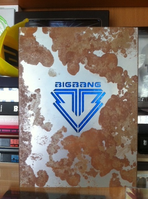
rusty old album
is that real rust or is it the design?
-
-
That's not true, 1 of 1 album cover is beautiful, but album is so tiny.
-
-
-
-
-
It's not ugly perse, and I also have to preface this by saying that I adore Cravity's music. They have a lot of bops under their belt, and this album is no exception, but this is poor graphic design to me.
Again, it doesn't make your eyes bleed with clashing colors or graphics, but the text is white against a light gray, and it doesn't stand out enough, you know? It would have been better to make it darker or perhaps implement a dark outline or drop shadow. As it is, it isn't a particularly interesting color combo.
Again, great album, design leaves more to be desired.
-
is that real rust or is it the design?
Actual rust
 but YG claimed it was intentional
 -
-
Display More
It's not ugly perse, and I also have to preface this by saying that I adore Cravity's music. They have a lot of bops under their belt, and this album is no exception, but this is poor graphic design to me.
Again, it doesn't make your eyes bleed with clashing colors or graphics, but the text is white against a light gray, and it doesn't stand out enough, you know? It would have been better to make it darker or perhaps implement a dark outline or drop shadow. As it is, it isn't a particularly interesting color combo.
Again, great album, design leaves more to be desired.
ah yes, a little bit contrast would help

-
The yellow-blue ver of Love Dive album.
It's.. idk even know what to say
that high saturated yellow and blue... is too much
and (for me) both those color would be weird to be made into gradation.
istg, even if their theory of using rgb-cmyk colors for their trilogy, this one is too much.
 External Content youtu.beContent embedded from external sources will not be displayed without your consent.Through the activation of external content, you agree that personal data may be transferred to third party platforms. We have provided more information on this in our privacy policy.
 -
Display More
The yellow-blue ver of Love Dive album.
It's.. idk even know what to say
that high saturated yellow and blue... is too much
and (for me) both those color would be weird to be made into gradation.
istg, even if their theory of using rgb-cmyk colors for their trilogy, this one is too much.
 External Content youtu.beContent embedded from external sources will not be displayed without your consent.Through the activation of external content, you agree that personal data may be transferred to third party platforms. We have provided more information on this in our privacy policy.
The colors are vibrant and very beautiful, there are uglier albums. I think this kind of vibrant album cover looks good on the chart. The logo of Le Sserafim album made the album look uglier and you have to tear the album apart to open it.
I think the Jewel case albums that Red Velvet used to release look simple and cheap. I didn't like The Red and The Velvet albums. The Velvet album cover looks blur.
That's why Red Velvet immediately did not become popular. Because of SM. Nugu companies have released more elaborate album packages. They also released a single version of the CD album for Red Velvet for quite a while. But these two albums seem the most sloppy on the cover and on the CD.
-
IVE love dive and after like so ugly
-
snsd's igab is so ugly and it breaks incredibly easy
235px-Girls'_Generation_-_I_Got_A_Boy_(All_Physical_Editions_2).jpg
-
-
Participate now!
Don’t have an account yet? Register yourself now and be a part of our community!


![CRAVITY 1ST ALBUM PART 1 [The Awakening: Written In The Stars] - Album by CRAVITY | Spotify](https://i.scdn.co/image/ab67616d0000b273f9cc1cf0c9e8a4587c8e28ca)
