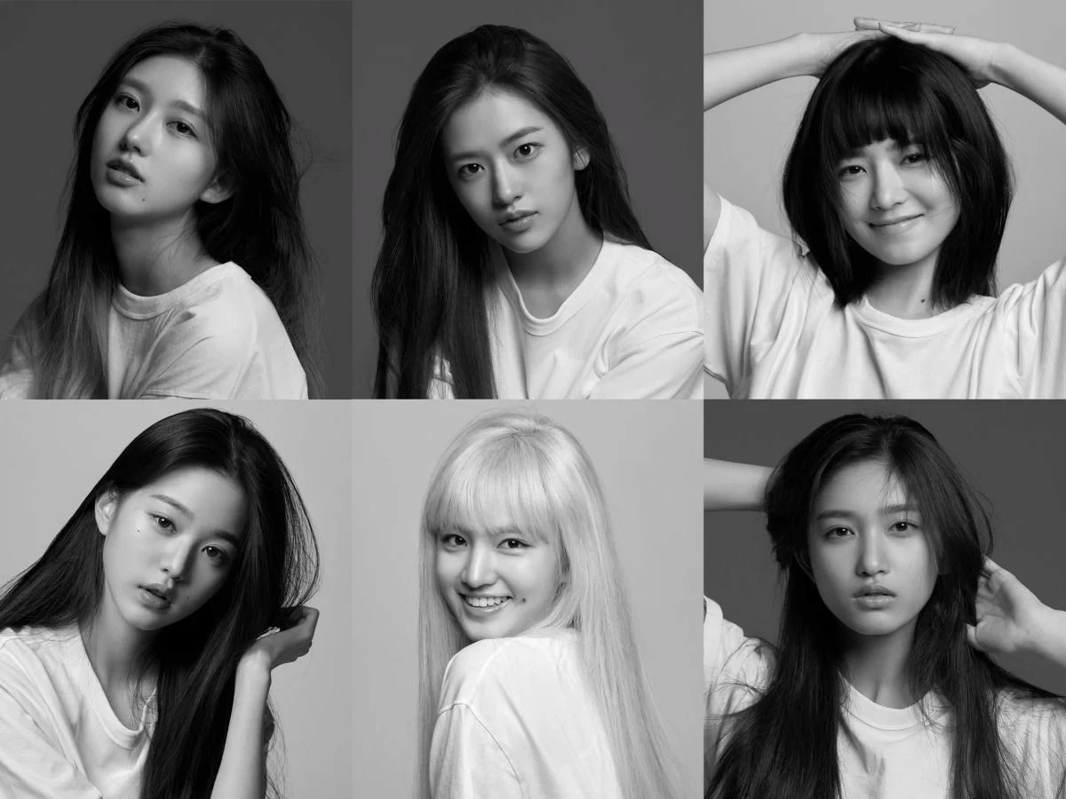
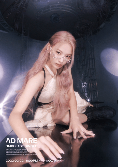
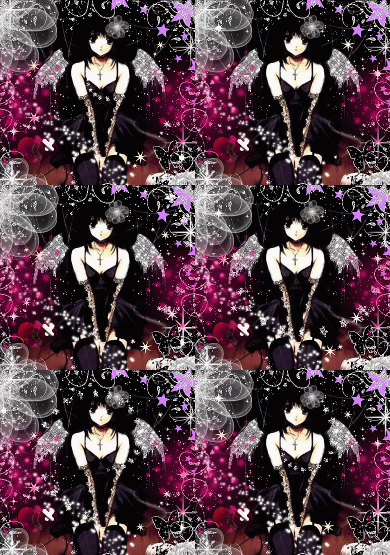
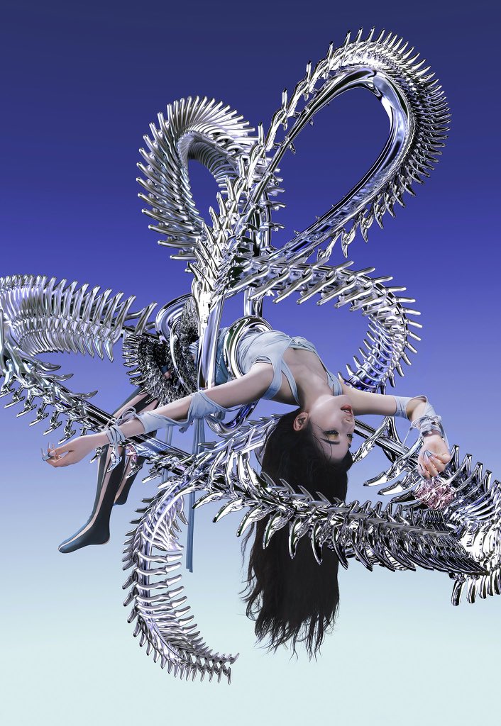
They're all pursuing the extravagant + kitsch + future-oriented concept
original post: here
1. No but this makes Le Sserafim f*cking comparableㅋㅋ They could've just shot photos like that without stirring anything
3. Aespa seriously feels like a lot of capital went into it
4. IVE seriously is so so....? Those emoticons around them feel so countrified... The edit of the 6 of them at the bottom is 1000x better and prettier... They look just as pretty with a simple photoshoot
5. I don't know who those 2 first groups are but it's so bad. They look like those Chinese gaming websites' posters
6. Aespa's concept is definitely good
7. StayC is my taste
8. StayC's faces seriously won the victory by sword here
9. StayC has the best ones
10. All of them gives the 90s-00s vibesㅋㅋㅋ


