 Display More
I don't think they needed to do too much neither
But i think the teaser would have looked better and looked like there's more work behind it
If they maybe did the girls shoot in the middle of a ring boxe, they could just make it black and white if they wanted to not be colorful
But the teaser pic would have looked so much better and so much more aesthetic if the girls would have been able to play with the ropes etc.... To pose and do something new
Because minimalist is sometimes good when the whole vibe fits it
But this time it just look like they had no idea what to do put them in the most minimalist background and that's it
Or not everything need to be put in the background the photographer could have directed the girls to do more dynamic pose to the picture to give the boxe feeling too
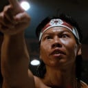
I think the boxing glove is the highlight. If I were Diverse 2, I'd give them neon gloves. Itzy used to use brighter colors in their teasers. I guess they didn't want to use it in this concept. I hope there will be a more colorful and elaborate background for the actual title track teasers. I personally did not notice the background from the girls. ![]() It's really just black and white. I didn't expect much from the teasers since the Diverse 2 were barely making a promo Itzy, it came out well according to my expectation.
It's really just black and white. I didn't expect much from the teasers since the Diverse 2 were barely making a promo Itzy, it came out well according to my expectation. ![]() All I want is for Itzy's teaser concept to match the song's concept. Because it wasn't like that last year. Since the Bet On Me concept teasers and song are compatible, the other teasers of the songs will be compatible, at least this time.
All I want is for Itzy's teaser concept to match the song's concept. Because it wasn't like that last year. Since the Bet On Me concept teasers and song are compatible, the other teasers of the songs will be compatible, at least this time.