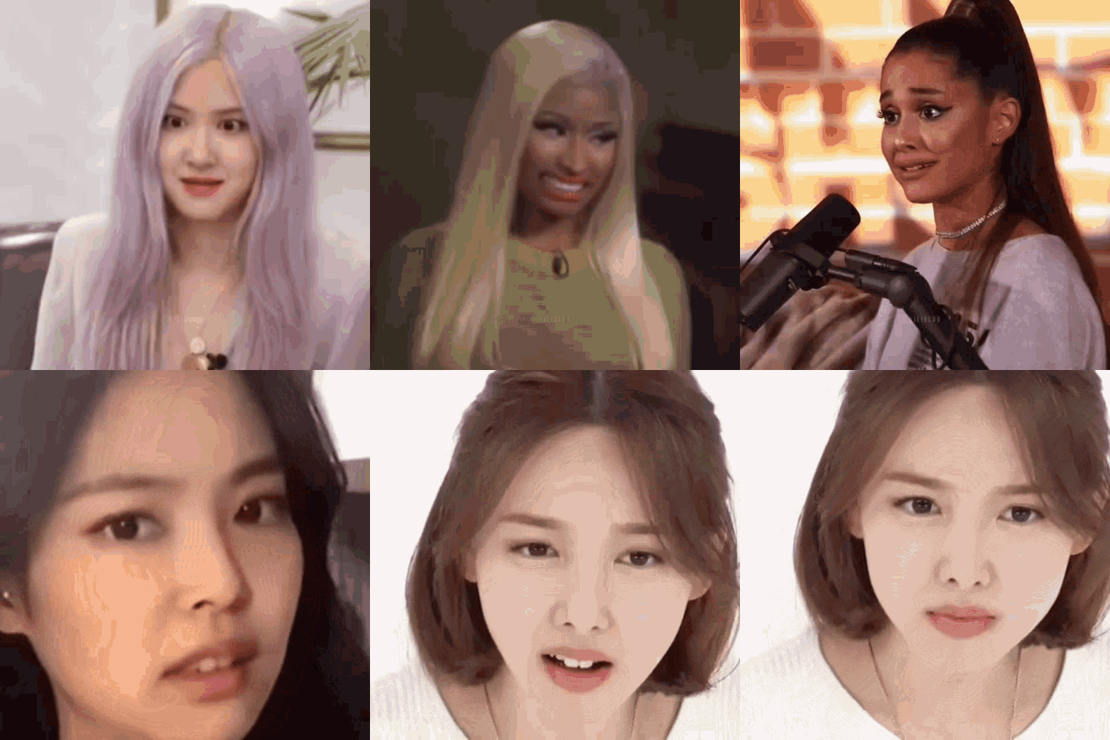
Themed Badge Submission Rules:
Q: Ever wondered what the offspring of a glamour shot and a passport photo might look like?
A: Oooh, that's right, a badge!
A badge should be aesthetically pleasing, but also accurately show what or who it portrays. Sound like a tall order? It definitely can be!
These are things you should keep in mind when submitting photos.
CROPPING & SIZING TIPS:
- The face should be centered and cropped in closely taking more than half the image.
- After cropping face closely, if you can, resize it to 128px by 128px using https://ezgif.com/resize
- If possible, round the corners to 10px using https://pinetools.com/round-corners-image
COLORING TIPS:
- Try to choose pics where the skin color is as natural as possible.
- Lighting should be clear enough to see facial features - not too dark, not too light.
- Try to submit sets or images that give the same feel across all the badges.
CONTENT TIPS:
- Anything the impedes clarity and identification such as hands/hair covering more than half of the face or closed/hidden eyes should not be submitted.
- Please no fashion shoots with exaggerated expressions or shots where people are looking down.
- Professional pictures only - no performance shots, no selfies or fan-taken photos.
To help visualize these:
 |
☑ Looking forward/up ☑ Face cropped closely in |
 |
☑ Fingers on less than half of face |
| ✕ Eyes closed | |
| ✕ Left eye closed | |
| ✕ Looking down | |
|
✕ Eye Hidden ✕ Hair covering more than half the face |
|
|
✕ Selfie ✕ Skin tone very washed out |
|
 |
✕ Cropped too far out ✕ Looking down |
 |
✕ Off-center ✕ Cropped too far out ✕ Looking down |
| ✕ Logo/Watermark | |

|
✕ Too much focus on neck ✕ Off-center ✕ Cropped too far out |
In other words, let's avoid:
Thanks from all of us here on the Badge Squad!
