
KPOP GROUP LOGOS: which is better?
-
-
-
-
Day6 logos, with different colours

Their latest comeback color
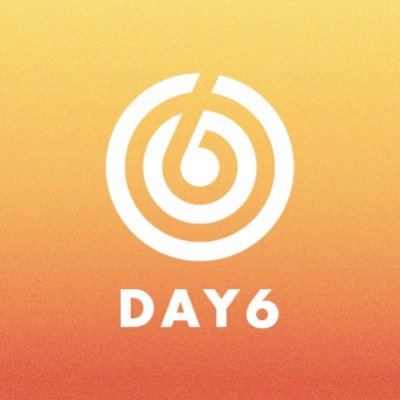
Everyday6 has many colours
-
I prefer fixed.
-
-
-
-
Why not both?
Mamamoo has an official logo
but they pretty much have a different 'M' logo for every album
-
-
-
if you don’t announce your comeback with a short animated video on the logo change, what are you even doing?
External Content youtu.beContent embedded from external sources will not be displayed without your consent.Through the activation of external content, you agree that personal data may be transferred to third party platforms. We have provided more information on this in our privacy policy.External Content youtu.beContent embedded from external sources will not be displayed without your consent.Through the activation of external content, you agree that personal data may be transferred to third party platforms. We have provided more information on this in our privacy policy.External Content youtu.beContent embedded from external sources will not be displayed without your consent.Through the activation of external content, you agree that personal data may be transferred to third party platforms. We have provided more information on this in our privacy policy.External Content youtu.beContent embedded from external sources will not be displayed without your consent.Through the activation of external content, you agree that personal data may be transferred to third party platforms. We have provided more information on this in our privacy policy. -
Fixed
-
EXO logos are the best. Class-leading.
Since every logo is related to comeback gives them a unique look with deeper context.
Here's to creativity :-
External Content twitter.comContent embedded from external sources will not be displayed without your consent.Through the activation of external content, you agree that personal data may be transferred to third party platforms. We have provided more information on this in our privacy policy.External Content twitter.comContent embedded from external sources will not be displayed without your consent.Through the activation of external content, you agree that personal data may be transferred to third party platforms. We have provided more information on this in our privacy policy. -
-
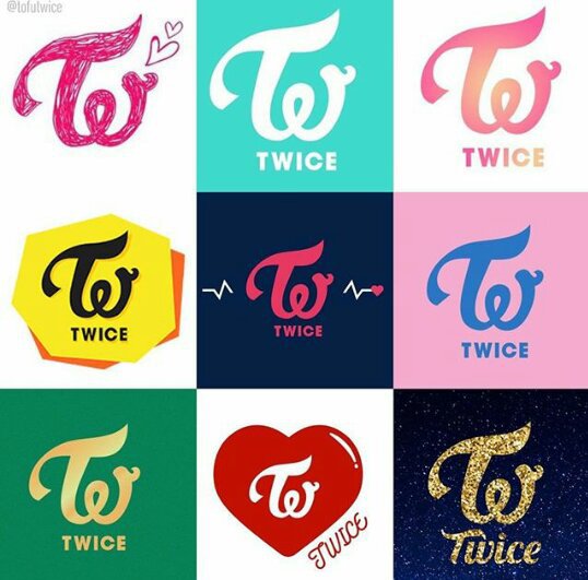
I think the custom logos for each era is really creative. A good example would be for Twice.
This is a older one, it only stops at DTNA
-
I wanted to say something about how my ulti group had 1 logo, but Google went like: "Did you really just forgot?"
And oh well...


And yes, the most ugly one is their newest logo ...
-
It’s so interesting to see other groups photos.
I like fixed.

-
-
The last one is the newest? Honestly, it's ugly. The first version looks much nicer. I never understood why companies would change a good design?
I have stuck with the first logo design I had for my small company. I didn't want to pay someone to design it for me, but I also had no idea how to make one myself.
A simple logo design templates search helped me find the one I wanted. I have used that same logo since the start. If I decide to change the logo, it will be a small change.
People fancy a simplistic logo style now. You have to take everything into account because the logo is important.
-
Your forex analysis is spot on! Thanks for sharing valuable tips. http://www.the-next-tech.com/b…schedule-in-south-africa/
-

Participate now!
Don’t have an account yet? Register yourself now and be a part of our community!